Creative Process: Moodboards
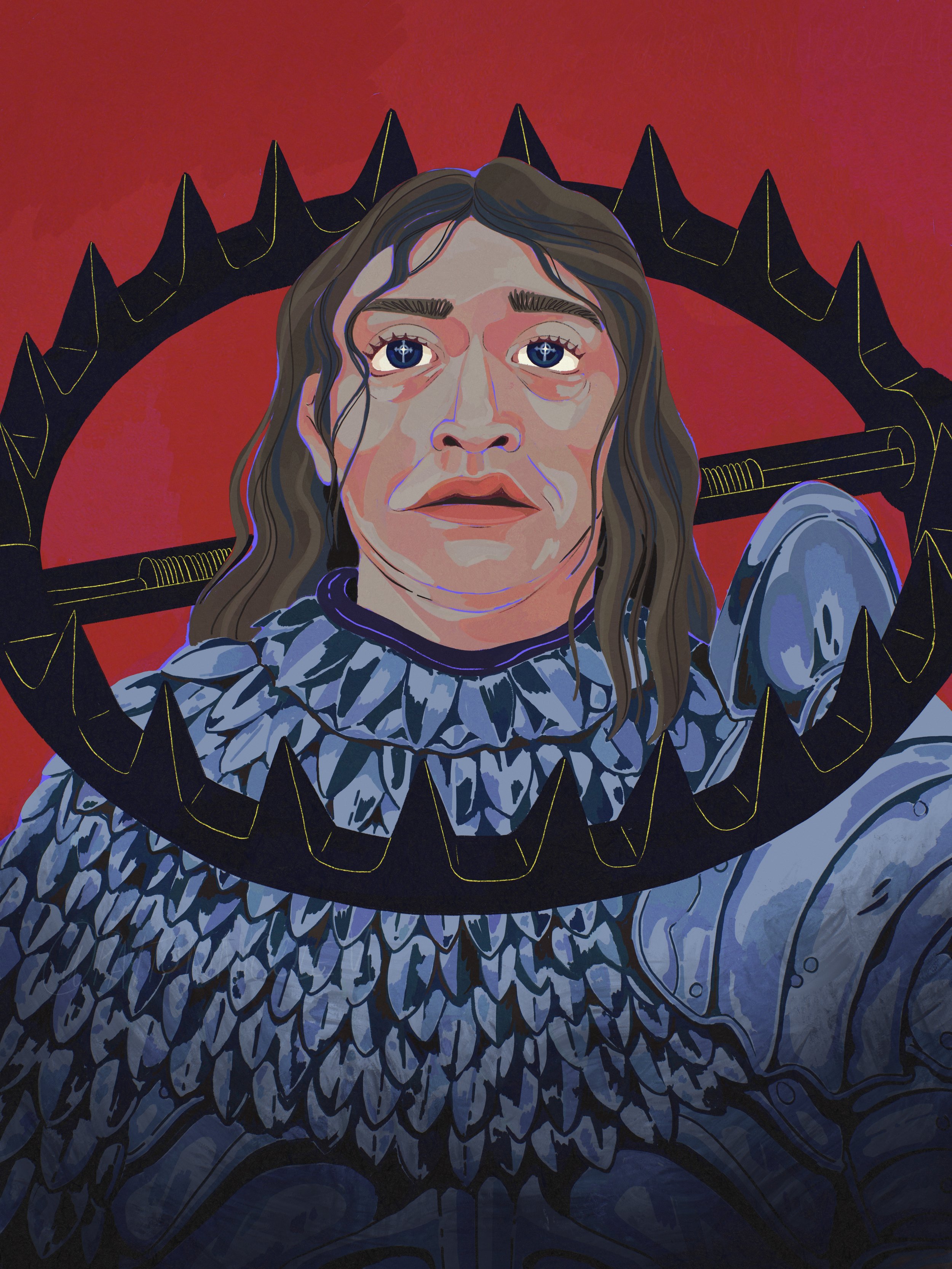
This is a little walkthrough of the process I use to plan some of my digital illustrations, using Vlad from Dracula as an example. This advice is probably better suited for video format so if you’d be interested in seeing that let me know. But for now this is what we’re working with.
Just as a disclaimer: I saw Dracula with a friend having seen no advertisement for it and I didn’t know the director was problematic - so maybe wait for this one to hit streaming before you watch :’) Sorry!
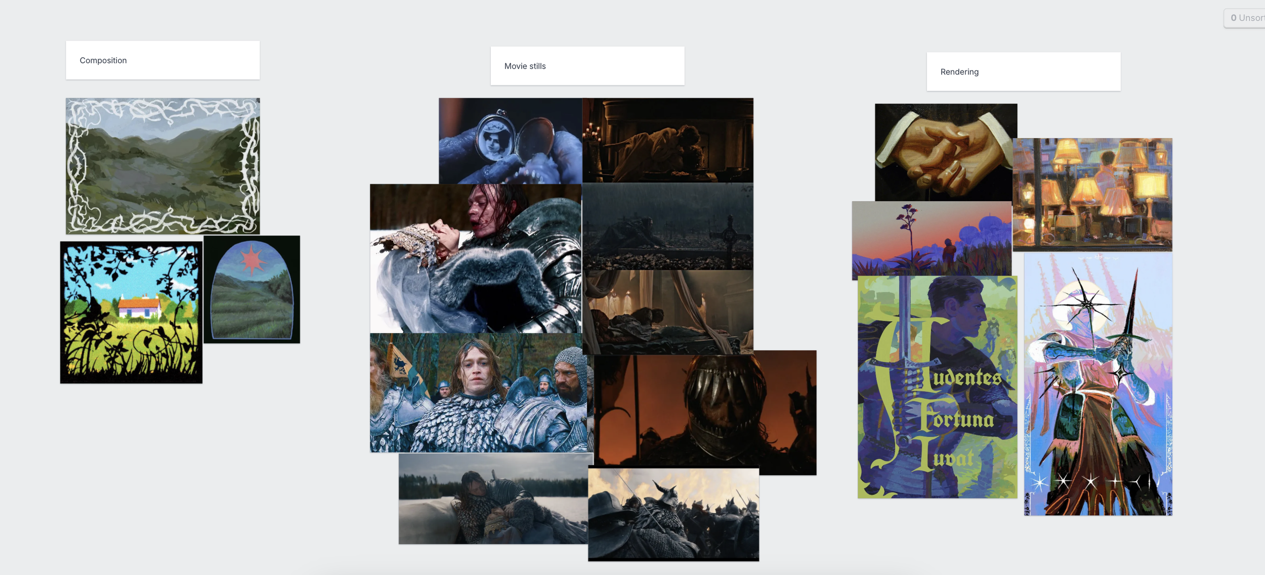
If I see a piece of media I want to make an illustration about but don’t have any specific ideas in mind; I usually jump into Milanote (This is not sponsored I just like using it for moodboards. You can use whatever software you want). I dump in a bunch of images and sort them into a few different sections which I’ll explain below. It helps me work through creative ideas without having to put them all on paper. This also helps me identify what I like about other art without directly copying other people’s work or concepts. I really enjoy illustrating when I have a kind of “north star’ to follow, and maybe that will be helpful for you as well!
Milanote Board Breakdown:
Artists whose work is on the moodboard (that I could locate, if you own of these tell me and i’ll add your tag 🩷 ) @rosasawyers, @lollalette, Leyendecker, @cardo-de-comer, @ratfestival
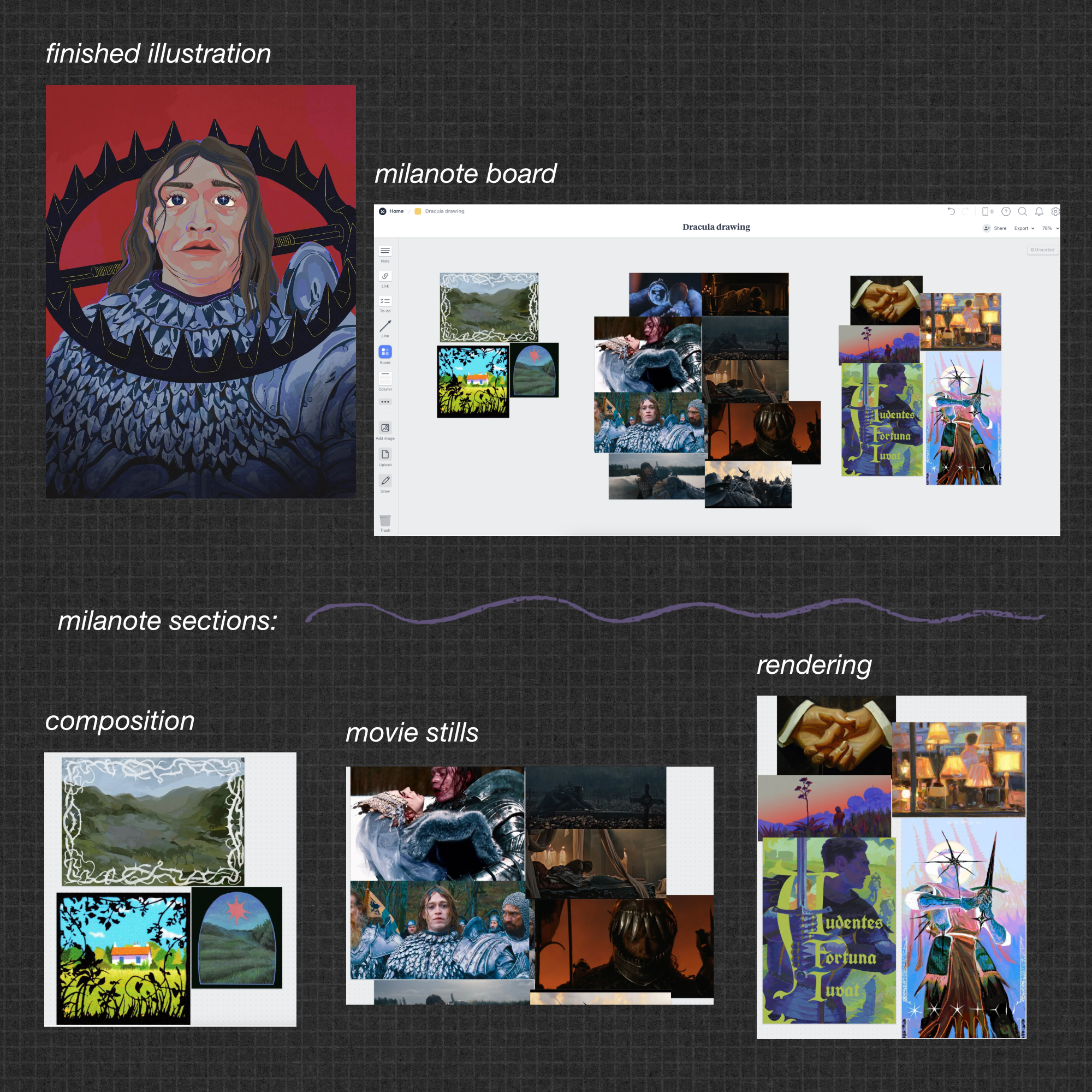
This board is broken into 3 parts; Composition, Movie Stills, and Color/Rendering.
I always start with movie stills – assuming I’m referencing a movie, pulling shots from the film I particularly enjoyed or think would fit the vibe I’m going for. It’s also good to have the stiills on hand for reference as I’m drawing. In this case I kind of combined this bluey centered, straight-on view of vlad with the ‘color story” of a later but also centered view where he’s post-battle.
You’ll notice there are a ton of other stills on the board and that’s because I was being indecisive :)
next up i pull composition inspo – if I already have some in mind which i did. I pulled these from an already saved pinterest board so I didn’t have to look too hard. They’re works I’ve already been vibing with and that have some common element. Sometimes these are also master works, sometimes they’re screenshots, it just depends. And I want to be clear the goal here is not to “Copy” anyone’s existing composition. The goal is to figure out what it is I like about these so I can implement it. In this case, it was the high contrast, entirely flat framing device. In the examples these are thorns, plants, architectural motifs. In my own work this ended up being the black bear trap, which is also a reference to a different scene in the movie so now we’re getting into more visual storytelling.
usually the last thing I find is color and/or render inspo – these are images that feel right in their color story, maybe they’re reminiscent of or intentionally contrasting the color theory in the film. The middle left image obviously inspired the color palette I ended up using in my artwork. I liked the blue/yellow contrast in the lamp illustration and incorporated that yellow into the subtle lines on the bear trap.
I also gathered examples of the level of rendering I’m going for (because I can’t be trusted and I will over-render and ruin the vibe if I’m not paying close attention). The top left image is Leyendecker (old horse old tricks) and I love the more graphic shapes of the shadows, which you can hopefully see in the shape of the highlights/shadows in Vlad’s face. You’ll see there are some knights pictured here, but inspo doesn’t have to be thematically related at all and I usually prefer it not to be. However, I quite liked the pencil texture on the bottom right illustration and the paint texture on the bottom left (as well as the large flat neon element, similar to the other composition inspo in that way). Both of those textures eventually show up in my Vlad piece.
I hope that all made sense. Maybe I’m too graphic-design-pilled but I think it’s good to explore your artistic preferences even when you’re not in the middle of making the art! It can be really clarifying. Kind of like a DiY Art Director, but you still call all of the shots.
If you use a similar method in your own work let me know I’d love to see your beautiful moodboards!
Until next time 💕